7 Multicolor Subway Backsplash Ideas We Can’t Stop Pinning
7 Multicolor Subway Backsplash Ideas We Can’t Stop Pinning
If you’ve spent any time scrolling design boards lately, you’ve probably noticed that plain white subway tile is starting to share the spotlight. Multicolor subway backsplashes are having a real moment, and honestly, it makes sense. They bring personality into a kitchen without you having to commit to bold wallpaper or a wild paint color. This is one of those upgrades that instantly makes a kitchen feel more custom without requiring a full renovation.
What I love about multicolor subway tile is how flexible it is. You can go subtle with soft tonal shifts, or you can go all-in with a rainbow of shades that turns your backsplash into the focal point of the whole room. Either way, it’s a look that photographs beautifully and holds up in real life, which is exactly why it keeps showing up on so many mood boards. Here are seven ways to work it into your space.
Soft Pastel Gradient
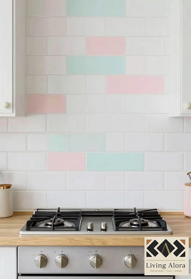
This look uses subway tile in muted pastels like blush, sage, buttery yellow, and powder blue, arranged in a gentle gradient from one end of the wall to the other. It reads as soft and dreamy rather than loud, which makes it a great fit for cottage-style kitchens or anyone who wants color without feeling like they’re living inside a candy shop.
It works especially well behind a stove or sink where you want a little visual interest without overwhelming the rest of the room. Pair it with white cabinets and brass hardware, and the pastel tones really get to shine. Grout in a warm white keeps things looking clean and lets the colors do the talking.
Maintenance is straightforward since ceramic tile in these finishes wipes down easily. The main thing to watch is grout staining over time, so a sealed grout or a slightly tinted grout can save you some scrubbing down the road.
Bold Jewel Tone Mix

For people who want their kitchen to feel a little dramatic, jewel tones are the way to go. Think emerald, sapphire, amethyst, and deep ruby subway tiles mixed together in an irregular pattern. It’s rich, it’s moody, and it makes a serious style statement.
This works best in kitchens with darker cabinetry or black fixtures, since the deep colors need something equally confident to play off of. I’ve also seen it done beautifully with matte black hardware and a butcher block counter for warmth. It’s not a shy look, but that’s kind of the point.
Glossy tile finishes help bounce light around the room, which keeps things from feeling too heavy. If you’re worried about commitment, try this as an accent strip above the stove rather than covering the whole wall.
Earthy Terracotta and Clay Tones
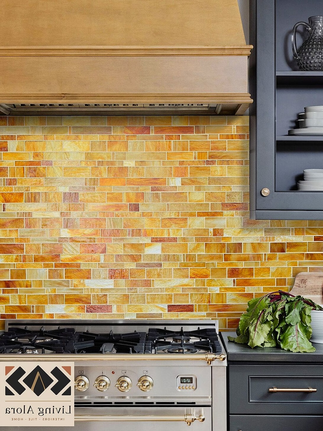
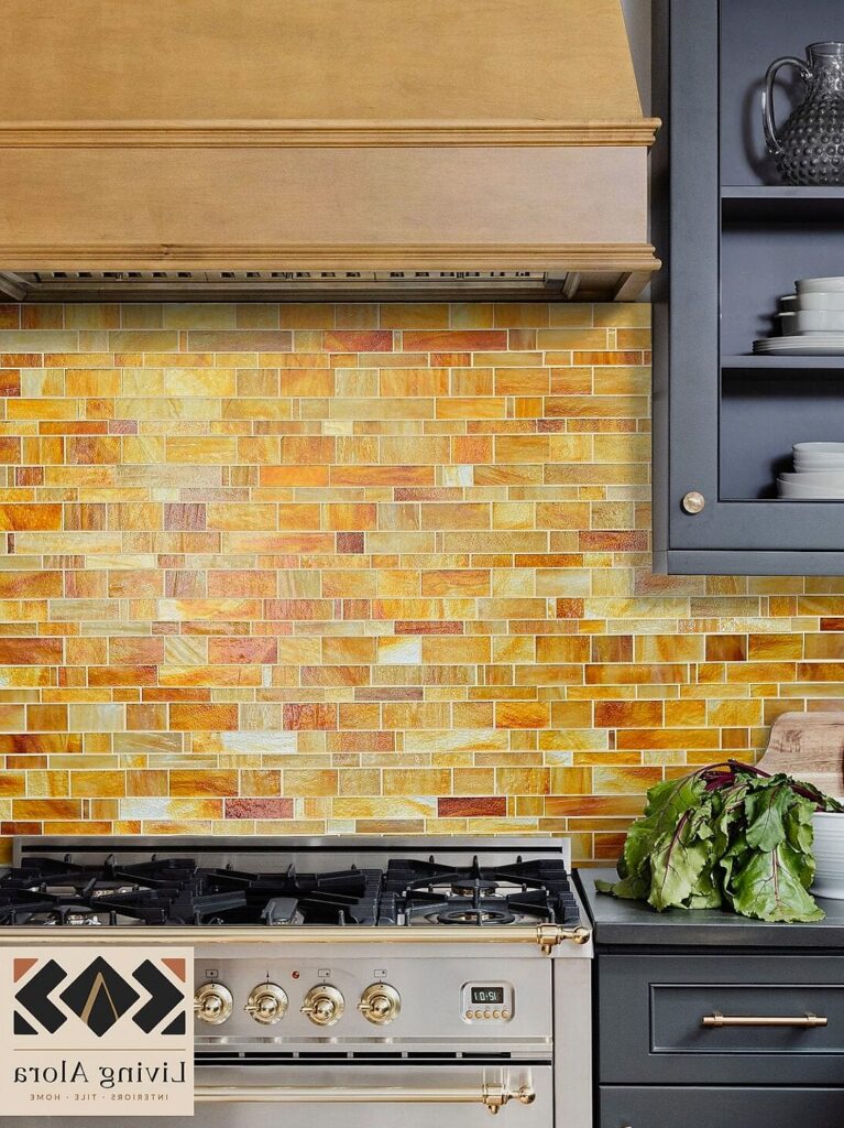
This variation leans into warm, sunbaked colors like terracotta, rust, ochre, and sandy beige. It has a Mediterranean, sun-soaked feel that pairs beautifully with wood accents and natural stone countertops. It’s warm in a way that white tile just can’t replicate.
Earthy multicolor subway tile works great in kitchens that already lean rustic or farmhouse, but it also looks surprisingly modern next to sleek matte black fixtures. The mix of tones gives depth to the wall without needing a busy pattern, since the color variation is doing all the visual work.
These shades tend to hide minor splatters and daily wear a little better than pure white tile, which is a nice bonus if you cook often. A quick wipe-down after dinner keeps things looking fresh.
Ocean-Inspired Blues and Greens

If you gravitate toward coastal or nautical vibes, a mix of teal, turquoise, seafoam, and navy subway tiles creates that breezy, by-the-water feeling. It’s calming without being boring, and it adds just enough color to keep a mostly neutral kitchen from feeling flat.
This palette works particularly well in kitchens with a lot of natural light, since the blues and greens really come alive when the sun hits them. White countertops and open shelving with a few plants nearby round out the look nicely. It’s also a solid choice for beach houses or lake homes where you want the interior to echo the scenery outside.
Porcelain tile in this style tends to resist moisture well, which is worth considering if your backsplash sits near a sink that sees a lot of splashing.
Retro-Inspired Color Blocking

This one channels a little vintage diner energy, using colors like mint green, cherry red, and buttercream yellow arranged in blocks or stripes rather than a random mix. It’s playful and nostalgic without feeling like a costume, especially when balanced with more modern cabinetry.
Retro color blocking is a fun option for anyone who wants their kitchen to feel a little more fun and less serious. It works particularly well in smaller kitchens or breakfast nooks where a bold design choice doesn’t overwhelm the whole house. Chrome or brushed nickel hardware ties the retro feel together nicely.
Because the colors are grouped rather than scattered, this layout is also fairly renter-friendly if you use peel-and-stick tile designed to mimic the look, since you can remove it later without much fuss.
Neutral Tones With a Pop of Color

Sometimes less really is more. This approach keeps most of the backsplash in soft neutrals like cream, greige, and warm white, then adds in just a handful of colorful tiles scattered throughout, maybe a dusty blue here, a rust orange there. It gives you personality without a full commitment to color.
This is a great middle ground for people who love the multicolor subway tile trend but aren’t ready to go bold across an entire wall. It also tends to age well since the base palette stays neutral even as trends shift. You can always swap out a few tiles later if you want to update the pop colors down the line.
It’s an easy option to pull off on a budget too, since you’re really only paying a premium for a small percentage of your total tile.
Handmade-Look Multicolor Zellige Style

Zellige tile has been everywhere lately, and the multicolor versions take that irregular, handcrafted look and run with it. Each tile has slight variations in color and texture, so even within a single shade family you get a really organic, one-of-a-kind wall. Mixing several colors together makes it feel even more artisanal.
This style shines in kitchens that want a European, old-world feel, especially paired with brass fixtures and open shelving displaying ceramics. It’s a slightly more luxury option since authentic zellige tile runs pricier than standard ceramic subway tile, but there are budget-friendly imitations that capture a similar textured, layered look.
Because the surface is naturally uneven, cleaning requires a little more attention in the grout lines, but most homeowners agree the character is worth the extra wipe-down.
Final Thoughts
Multicolor subway tile backsplashes are such a fun way to add character to a kitchen without going overboard. Whether you lean toward soft pastels, moody jewel tones, or a scattered pop of color against a neutral base, there’s a version of this trend that fits almost any style and budget. The best part is you don’t need a full remodel to pull it off, just a wall, some tile, and a little bit of color confidence.