23 Colorful Backsplash Ideas That Will Change How You See Your Home

- Deep Emerald Green Zellige Tile
- Terracotta Orange Subway Tile
- Cobalt Blue Mosaic Backsplash
- Blush Pink Ceramic Tile
- Sunny Yellow Herringbone Pattern
- Navy Blue Subway Tile with White Grout
- Rust Red Zellige Tile
- Turquoise Mosaic Tile
- Mustard Yellow Subway Tile
- Sage Green Ceramic Tile
- Coral Pink Fish Scale Tile
- Deep Plum Subway Tile
- Chartreuse Green Mosaic Backsplash
- Burnt Orange Zellige Tile
- Periwinkle Blue Subway Tile
- Olive Green Herringbone Tile
- Hot Pink Ceramic Tile
- Teal Blue Zellige Tile
- Marigold Orange Mosaic Tile
- Wine Red Subway Tile
- Aqua Blue Fish Scale Tile
- Copper and Rust Mixed Mosaic
23 Colorful Backsplash Ideas That Will Change How You See Your Home
For years, the go-to move in kitchen design was safe, neutral, and forgettable. White subway tile everywhere, greige walls, and backsplashes that blended into the background instead of standing out. That’s changing fast, and honestly, it’s about time.
Color is having a real moment in kitchens and bathrooms right now, and the backsplash is the easiest place to embrace it. It’s a small enough surface that you won’t get sick of it in six months, but it’s impactful enough to completely shift the mood of a room. A colorful backsplash can make a kitchen feel warmer, more personal, and a lot more interesting to cook in.
Whether you’re planning a full renovation or just want to swap out a boring builder-grade backsplash, these 23 colorful backsplash ideas will give you plenty to think about. Some are bold, some are subtle, and a few might surprise you.
Deep Emerald Green Zellige Tile
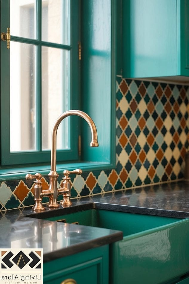
There’s something about emerald green zellige that photographs beautifully and looks even better in person. Each tile has that handmade, slightly irregular surface that catches light differently depending on where you’re standing.
This works especially well in kitchens with brass hardware or warm wood cabinetry, since the green pulls out those undertones. It’s a pricier option, but a small backsplash area doesn’t require much material, so the splurge is manageable for most budgets.
Cleaning is straightforward with a soft cloth and mild soap, though you’ll want to seal it periodically since it’s a natural clay tile.
Terracotta Orange Subway Tile
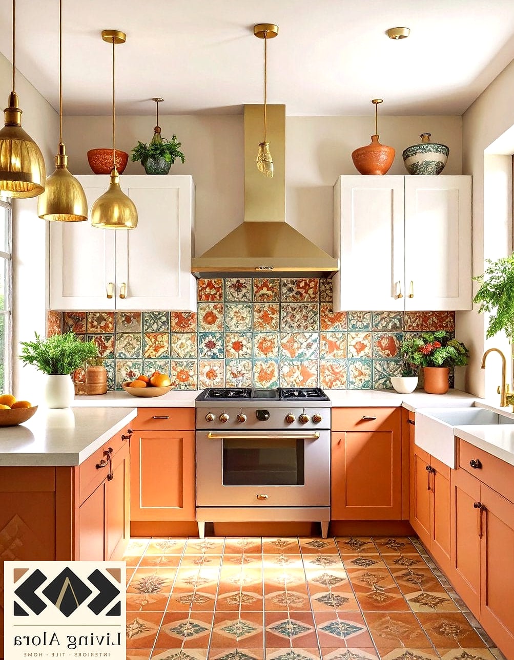
Terracotta isn’t just for planters anymore. A warm, burnt-orange subway tile brings an earthy, sun-baked feel to a kitchen that neutral tones just can’t replicate.
This color pairs beautifully with white or cream cabinets and looks especially good in kitchens that get a lot of natural light. It leans Mediterranean without feeling like a themed room, which is a nice balance to strike.
Budget-friendly ceramic versions are widely available, so this is one of those ideas that doesn’t require a luxury price tag to pull off.
Cobalt Blue Mosaic Backsplash
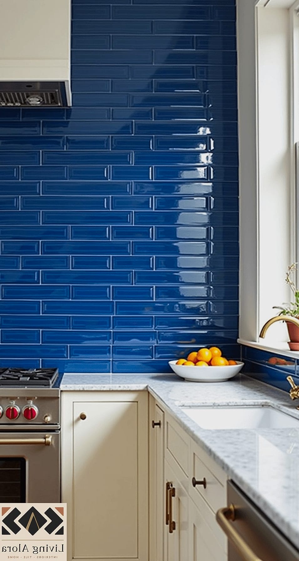
Cobalt blue mosaic tile is bold, and it knows it. This is the kind of backsplash that becomes the focal point of the entire kitchen, so everything else in the space should stay relatively simple.
Pair it with white countertops and cabinetry to let the color really sing. It also works surprisingly well in small kitchens, where a little color goes a long way toward making the space feel designed rather than default.
Mosaic sheets are more labor-intensive to install than large-format tile, so factor that into your timeline if you’re doing this as a DIY project.
Blush Pink Ceramic Tile
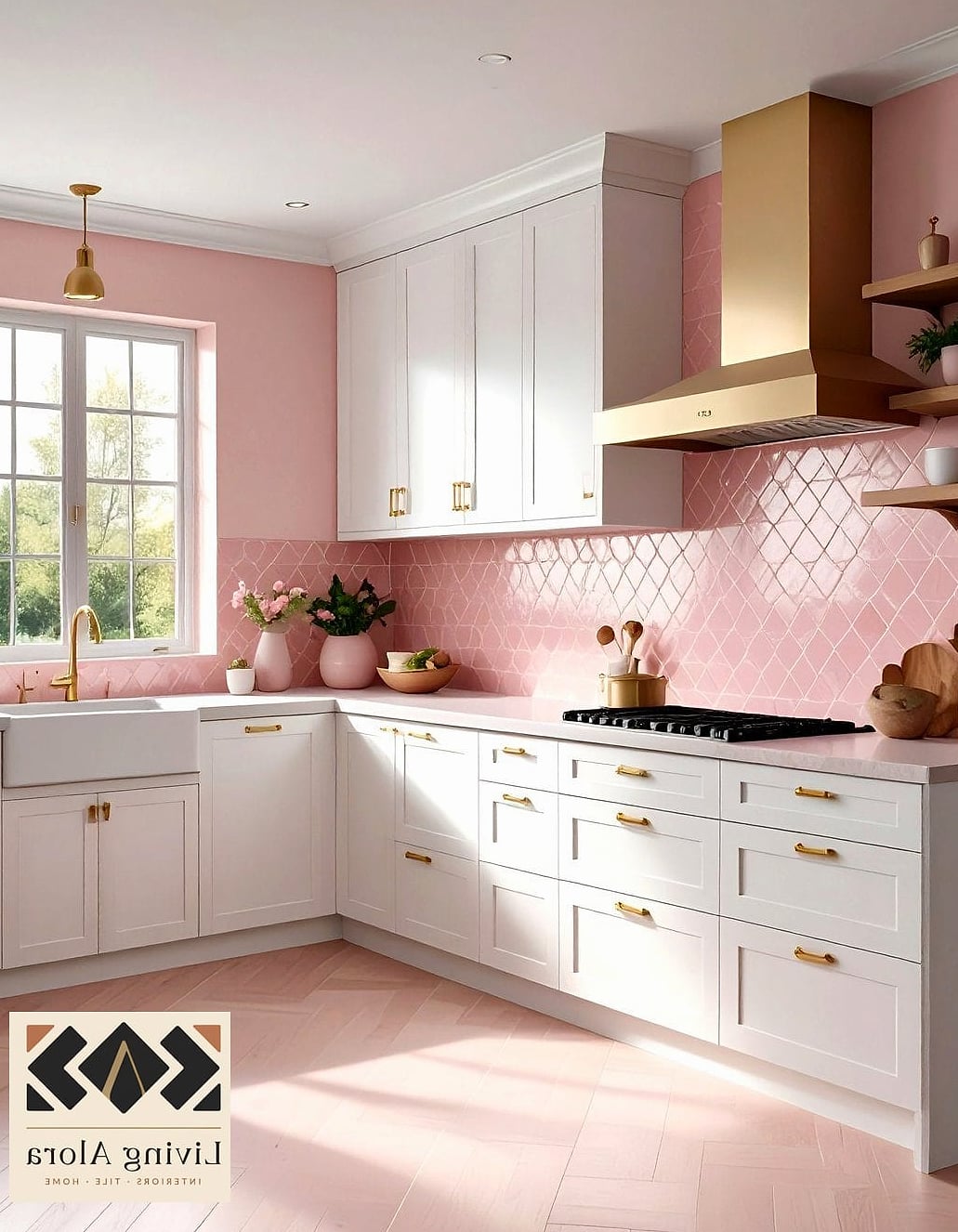
Blush pink has quietly become one of the most requested backsplash colors, and it’s easy to see why. It’s soft enough to feel calming but still reads as a deliberate design choice rather than an accident.
This color works particularly well in kitchens with black fixtures or brushed brass hardware, since the contrast keeps things from feeling too sweet. It’s also a great option for renters, since peel-and-stick versions in similar tones are easy to find now.
Ceramic tile in this shade is low-maintenance and wipes clean easily, which matters in a space where you’re cooking daily.
Sunny Yellow Herringbone Pattern

A herringbone layout already adds movement and texture to a backsplash, and doing it in a warm yellow takes that energy up another notch. This is a great choice for kitchens that don’t get a ton of natural light, since the color brings its own warmth to the room.
It works especially well as an accent behind a stove or range, where you want a little drama without covering every wall. Keep the surrounding cabinetry neutral so the pattern and color have room to stand out.
Navy Blue Subway Tile with White Grout

Navy is one of those colors that reads as sophisticated rather than trendy, which makes it a safer long-term bet if you’re worried about committing to something too loud. Paired with crisp white grout, the classic subway shape keeps things timeless while the color adds personality.
This combination looks great in coastal-inspired kitchens or anywhere you want a moodier, more grounded feel. It also hides daily splatters better than pure white tile, which is a practical bonus for busy families.
Rust Red Zellige Tile
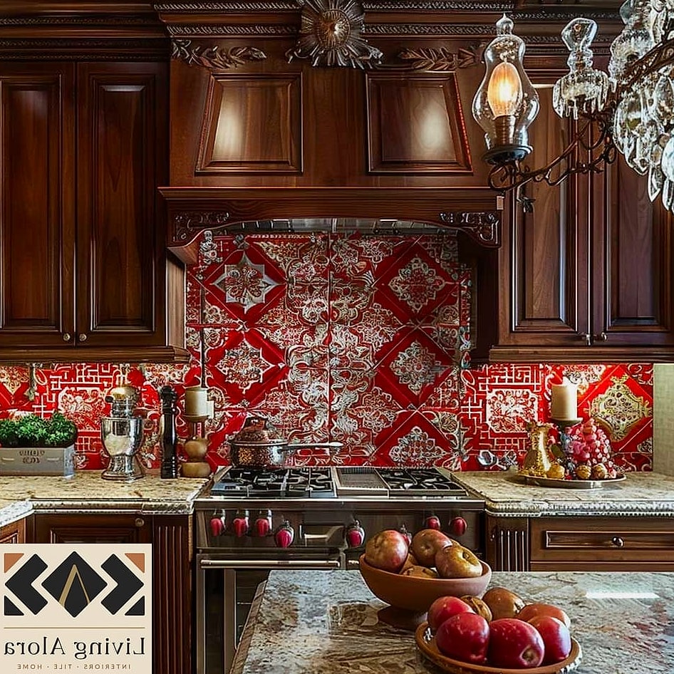
Rust red zellige has that same handmade charm as its green counterpart, but with a deeper, more grounding effect on a space. It’s a fantastic option for kitchens with dark wood cabinetry or matte black fixtures, since the warmth balances out the darker tones.
This color choice tends to feel more autumnal and cozy, so it’s especially popular in kitchens meant to feel lived-in rather than showroom-perfect. Expect some color variation tile to tile, which is part of the charm rather than a flaw.
Turquoise Mosaic Tile
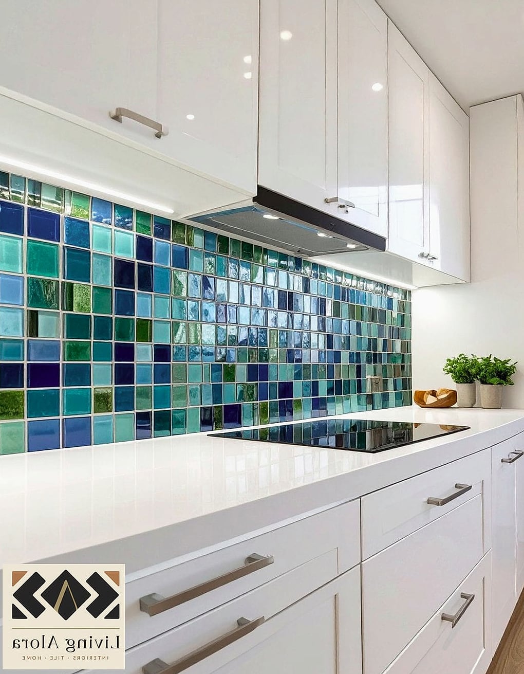
Turquoise brings a coastal, almost tropical energy to a kitchen without going full theme-park. It photographs incredibly well against white shaker cabinets and butcher block countertops, giving the whole space a fresh, breezy feel.
This is a fun option for a kitchen that doesn’t take itself too seriously. Mosaic sheets in turquoise also work nicely as a smaller accent strip if you’re not ready to commit to a full wall.
Mustard Yellow Subway Tile

Mustard is bolder and more saturated than a soft buttery yellow, and it tends to read as more intentional and modern as a result. It pairs surprisingly well with black hardware and open shelving, especially when styled with a few plants or ceramic pieces in complementary tones.
This color works best in kitchens with plenty of natural light, since it can feel a bit heavy in darker spaces. Consider it for a smaller accent wall if you’re nervous about going bold on the whole backsplash.
Sage Green Ceramic Tile

Sage has stuck around longer than most trend colors because it’s genuinely easy to live with. It reads as calm and organic, and it plays well with almost every cabinet color, from white to navy to natural wood.
This is a great pick if you want color without committing to something loud. It’s also forgiving when it comes to matching future decor, since sage tends to work with warm and cool tones alike.
Coral Pink Fish Scale Tile
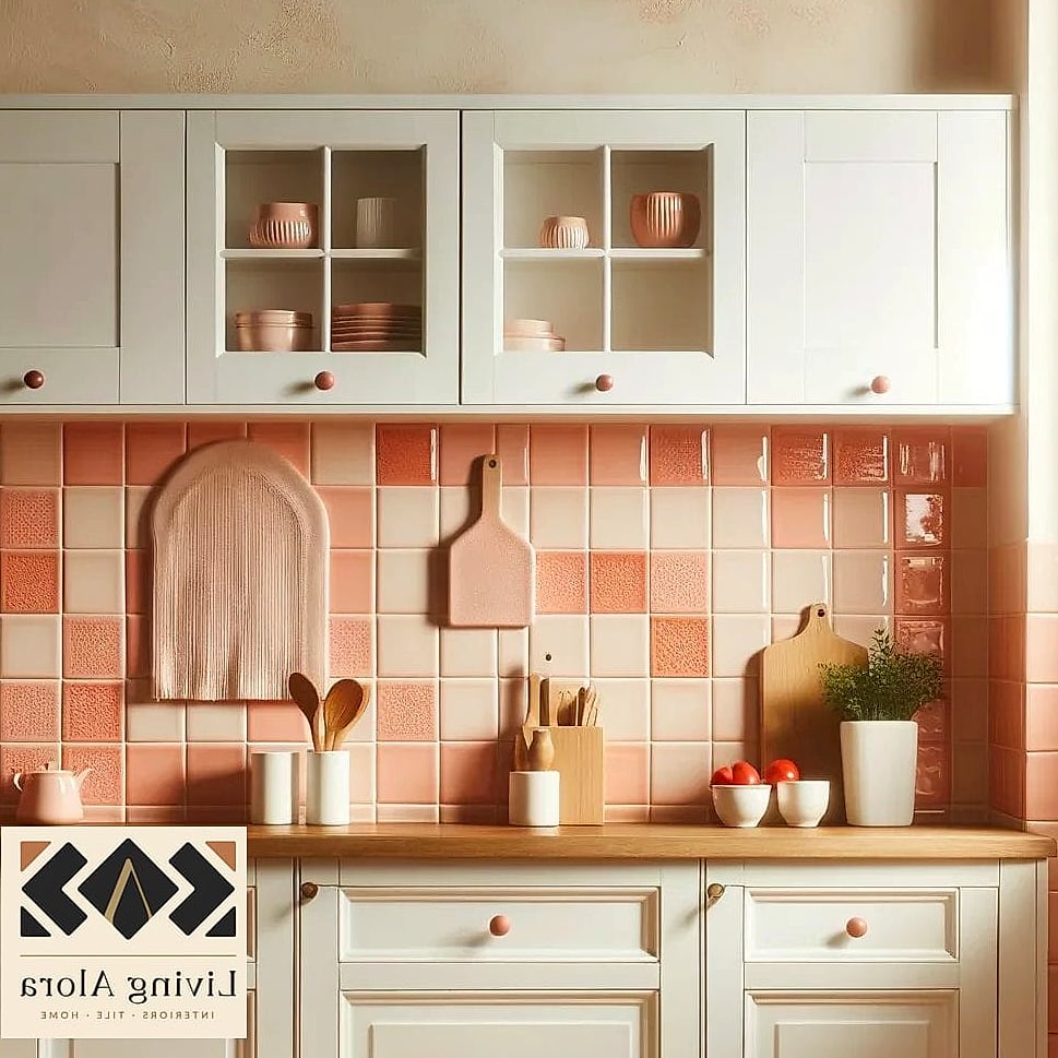
Fish scale, or scallop-shaped tile, already brings a playful shape to a backsplash, and coral pink pushes that personality even further. This combination feels fun and a little unexpected, which is exactly what makes it memorable.
It works particularly well behind a bar cart or in a butler’s pantry, where you want a bit of drama in a smaller, contained space. Because the shape is more intricate, expect a slightly higher installation cost.
Deep Plum Subway Tile
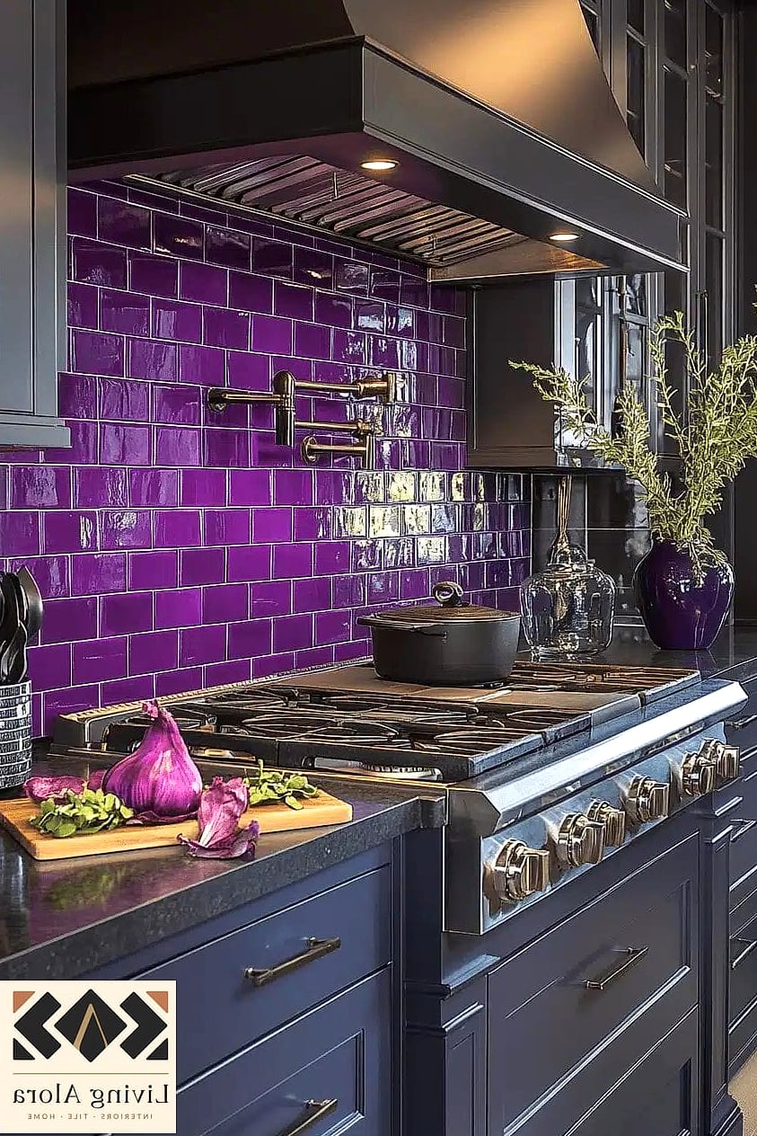
Plum is an underrated backsplash color that feels rich and a little unexpected. It reads as moody and elegant rather than dark for the sake of being dark, especially when paired with brass or gold fixtures.
This works well in kitchens that already lean toward a more dramatic, restaurant-style aesthetic. Keep countertops light to balance out the depth of the color.
Chartreuse Green Mosaic Backsplash
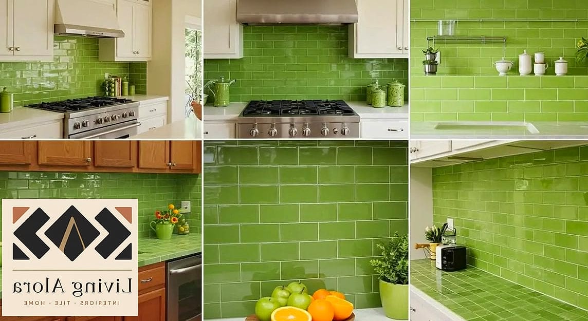
Chartreuse is a color that people either love immediately or need some convincing on, but it’s undeniably eye-catching. This vibrant yellow-green works best as a smaller accent, like above a stove or within a niche, rather than covering an entire wall.
It pairs nicely with white or light wood cabinetry and adds a retro, almost mid-century feel to a kitchen. This is a fun choice if you want your space to feel a little different from everyone else’s.
Burnt Orange Zellige Tile

Burnt orange zellige leans warmer and more muted than terracotta, giving it a slightly more sophisticated, less playful feel. It works beautifully in kitchens with dark cabinetry, where the color adds warmth without competing for attention.
Because zellige has that handcrafted texture, the color shifts subtly depending on the light in the room throughout the day, which adds a lot of visual interest over time.
Periwinkle Blue Subway Tile
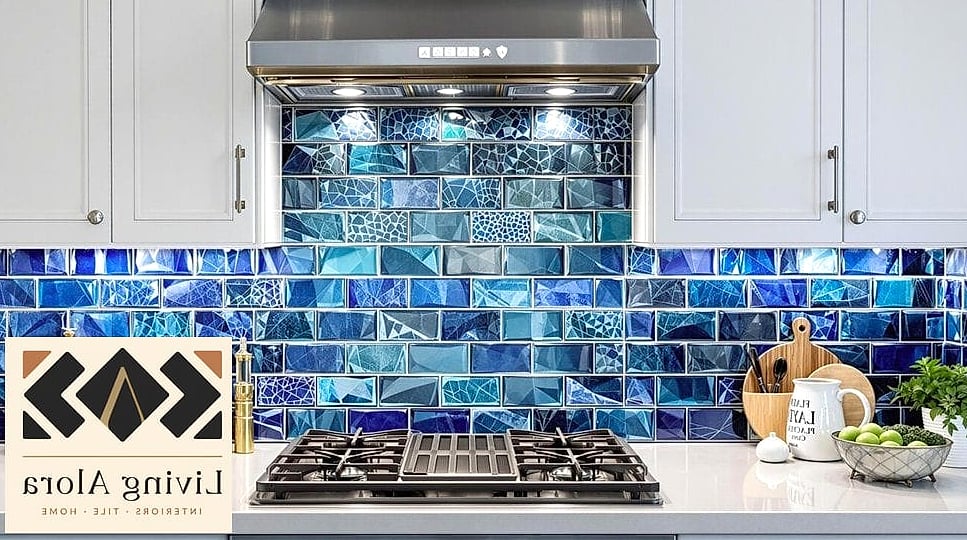
Periwinkle sits somewhere between blue and purple, and it brings a soft, slightly whimsical quality to a kitchen. It’s less common than navy or cobalt, which makes it feel fresher if you’re trying to avoid the most obvious blue backsplash choices.
This color pairs well with white oak cabinetry and brushed nickel hardware for a look that feels current without chasing every trend.
Olive Green Herringbone Tile
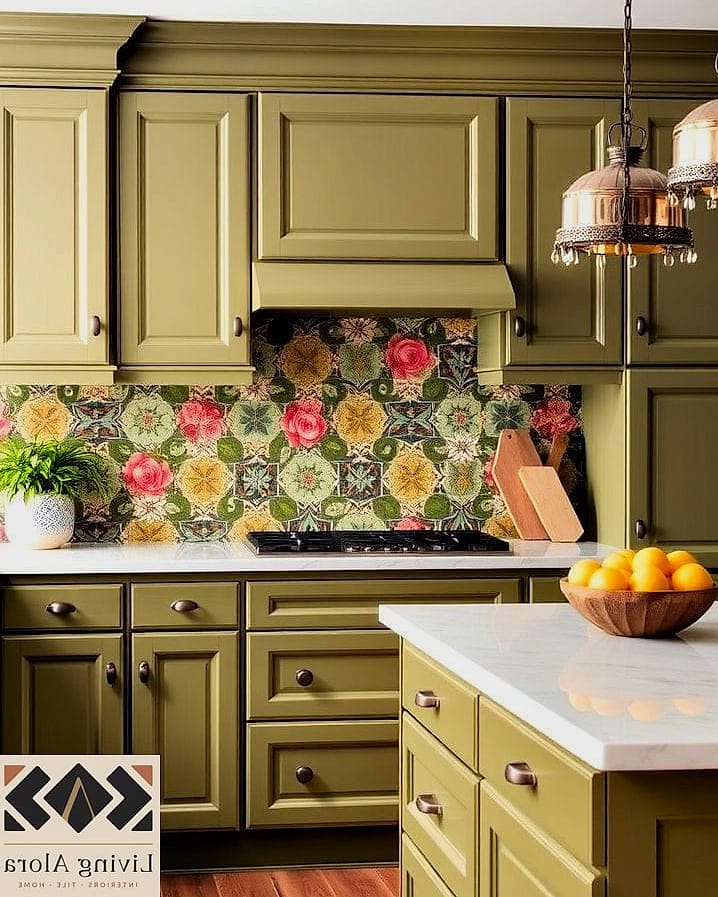
Olive is deeper and earthier than sage, giving it a more grounded, almost vintage feel. The herringbone pattern adds texture and movement, which keeps the color from feeling flat or one-note.
This combination works especially well in kitchens with warm wood tones and matte black fixtures. It’s a great choice if you want your kitchen to feel collected over time rather than perfectly matched.
Hot Pink Ceramic Tile

Hot pink is not for the faint of heart, but in the right kitchen, it’s genuinely fun. This is a great option for a small accent wall, a butler’s pantry, or a powder room sink area where you want maximum personality in a contained space.
Balance it with plenty of white or black to keep the room from feeling overwhelming. This is one idea that works best when you commit fully rather than trying to tone it down.
Teal Blue Zellige Tile

Teal has more green in it than a straightforward blue, which gives it a slightly more unexpected, jewel-toned quality. In zellige form, the texture and color variation make the backsplash feel almost like a piece of art rather than just a functional surface.
This pairs beautifully with warm wood cabinetry and brass fixtures, creating a rich, layered look that feels intentional and high-end.
Marigold Orange Mosaic Tile
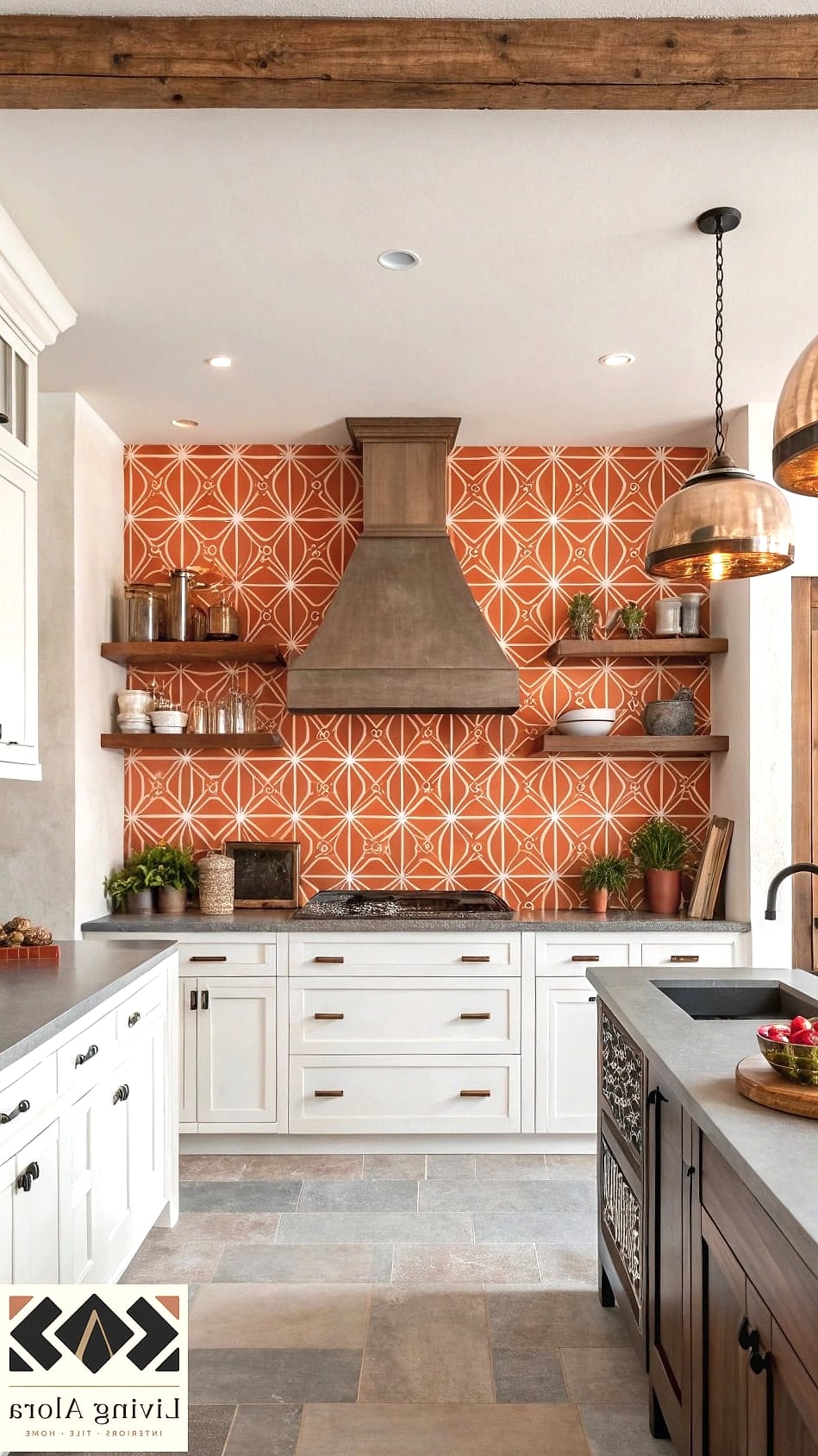
Marigold is warmer and more golden than a straight orange, and it brings a cheerful, energizing quality to a kitchen. This color works particularly well in breakfast nooks or smaller kitchen areas where you want the space to feel bright and welcoming first thing in the morning.
Pair it with white countertops and simple hardware so the color has room to be the star.
Wine Red Subway Tile

Wine red is deeper and more sophisticated than a bright red, making it easier to live with long-term. It works beautifully in kitchens with black or brushed brass fixtures, adding a sense of richness without feeling overly dramatic.
This is a solid option if you love the idea of a colorful backsplash but want something that reads as more classic and less trend-driven.
Aqua Blue Fish Scale Tile

Aqua fish scale tile brings texture and color together in a way that feels distinctly coastal without being overly literal about it. The scalloped shape adds visual interest even before you factor in the color, making this a great focal point for a smaller kitchen or a bathroom vanity backsplash.
It pairs nicely with white or natural wood, keeping the overall look light and airy.
Copper and Rust Mixed Mosaic
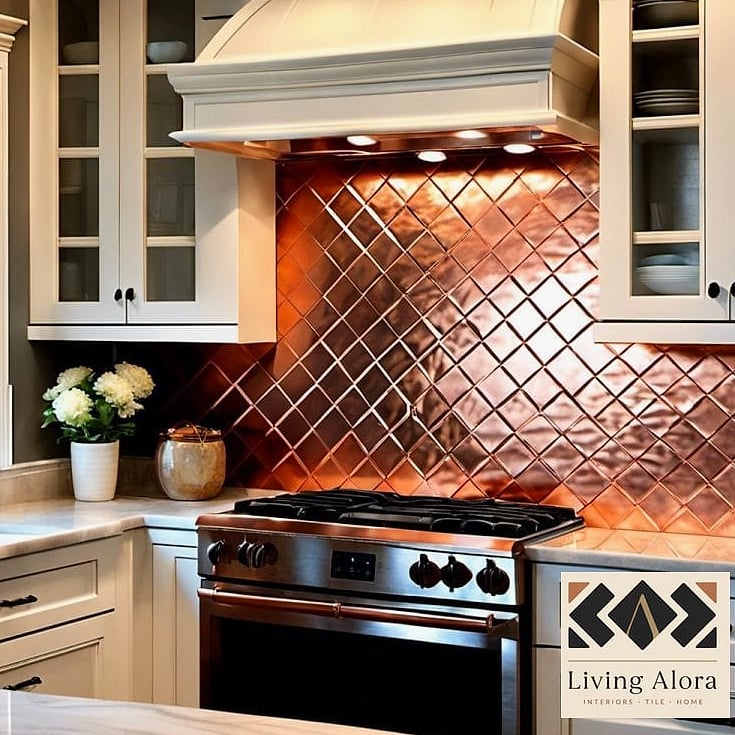
For something a little different, a mosaic that blends copper, rust, and warm orange tones creates a backsplash with genuine depth and dimension. Instead of one flat color, you get subtle variation that changes depending on the light and angle.
This works particularly well in kitchens with warm metal fixtures and wood accents, tying the whole color story together in a way a single-tone tile can’t quite achieve.
Choosing a colorful backsplash really comes down to how bold you’re ready to go and how the rest of your space is set up. Some of these ideas work as a dramatic focal wall, while others are better suited to a smaller accent area behind a stove or sink. Either way, color is one of the most affordable ways to make a kitchen feel like yours instead of a copy of someone else’s Pinterest board.