9 Grout Colors for Subway Tile Ideas That Are Stylish and Practical
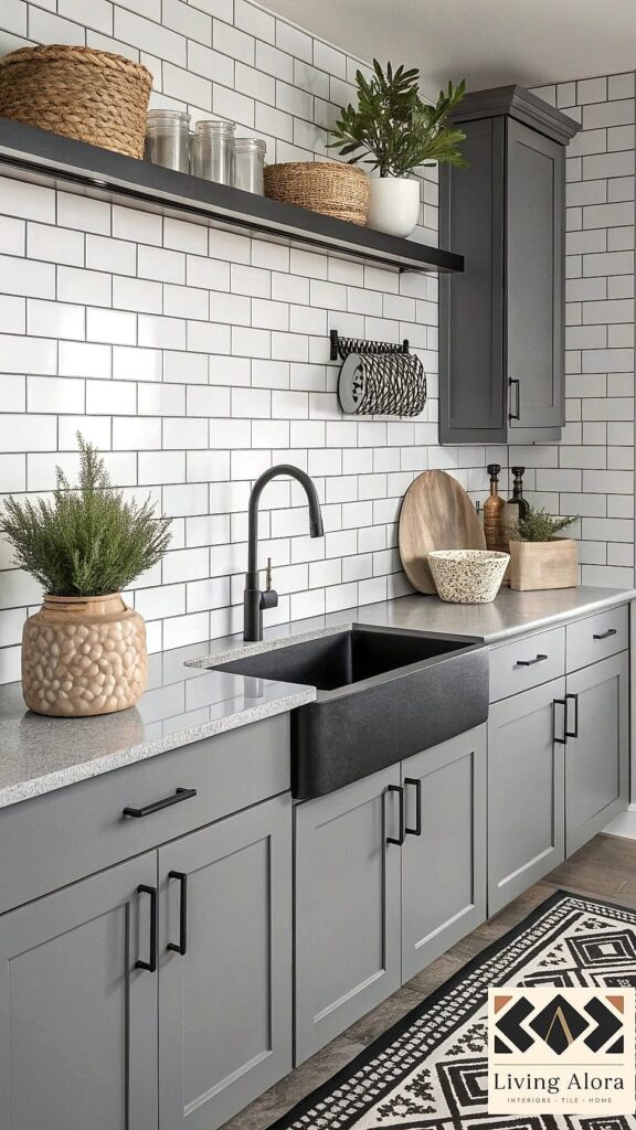
9 Grout Colors for Subway Tile Ideas That Are Stylish and Practical
Grout color is one of those decisions that seems small until you realize it completely changes the personality of your tile. The same white subway tile can look crisp and modern or soft and vintage depending entirely on what’s between the tiles. If you’re standing in the tile aisle overwhelmed, this list should help narrow things down.
Picking the right grout color isn’t just about looks, either. It affects how much maintenance you’ll deal with down the road, how forgiving the finish is with everyday grime, and how much the whole installation costs to keep looking fresh. Here are nine grout colors worth considering for your next subway tile project.
Classic White Grout

White grout with white subway tile is the look most people picture when they think “subway tile,” and there’s a reason it never really goes out of style. It creates a clean, seamless surface that makes a small kitchen or bathroom feel more open and airy.
This combo works especially well in spaces where you want the tile to fade into the background rather than steal attention from other design elements like brass hardware or a statement light fixture. It’s a natural fit for coastal, farmhouse, and modern minimalist kitchens alike.
The catch is maintenance. White grout shows dirt, grease splatters, and soap scum faster than darker options, so it’s best suited for households willing to do a quick wipe-down routine or seal it well upfront. A DIY-friendly grout sealer applied once or twice a year goes a long way here.
Dramatic Charcoal Grout
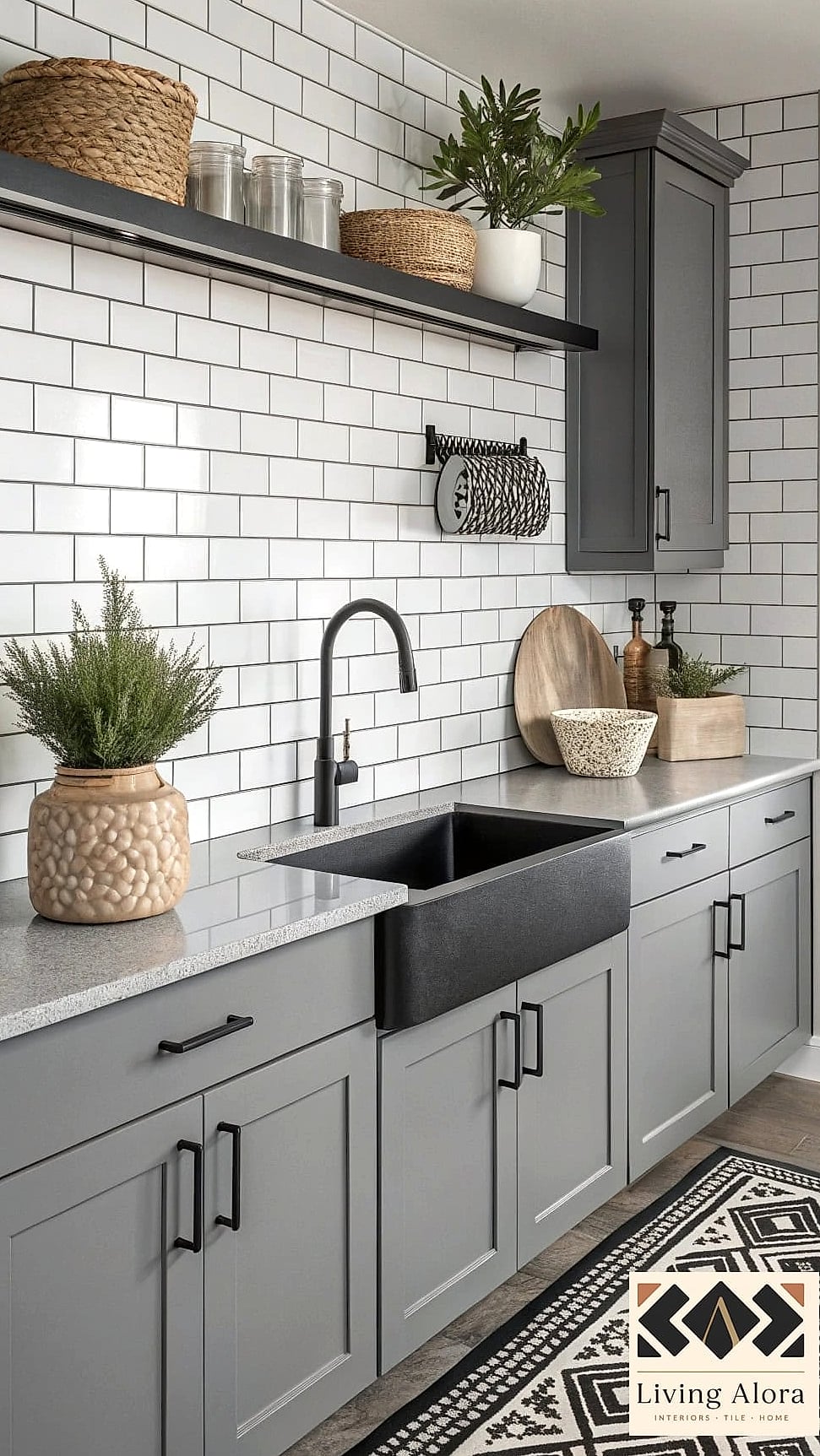
Charcoal grout against white subway tile has become a favorite for a reason — it turns a basic tile pattern into something that actually reads as a design choice. The contrast highlights the grid layout, giving the wall a graphic, almost architectural quality.
This pairing works beautifully in kitchens going for an industrial or modern farmhouse vibe, and it’s particularly striking with matte black fixtures or dark cabinetry. It also happens to be one of the more practical choices on this list.
Charcoal hides daily grime far better than lighter grout, which makes it a smart pick for busy families or anyone who’d rather not scrub grout lines every weekend. Just know that the contrast is bold, so it’s worth taping off a small test section before committing to a full wall.
Soft Gray Grout

Gray grout is the quiet middle ground between white and charcoal, and honestly, it might be the most versatile option here. It softens the crispness of white tile just enough to look intentional without creating heavy contrast.
Light gray grout tends to suit modern and transitional kitchens, while a deeper warm gray leans nicely into more traditional or European-inspired spaces. It pairs well with brushed nickel, matte black, or even brushed brass depending on the exact undertone you choose.
From a practical standpoint, gray is a great compromise for people who want something more forgiving than white but aren’t ready to commit to a high-contrast look. It hides light dust and water spots reasonably well, which makes it a solid pick for bathroom showers and tub surrounds.
Warm Beige or Sand Grout
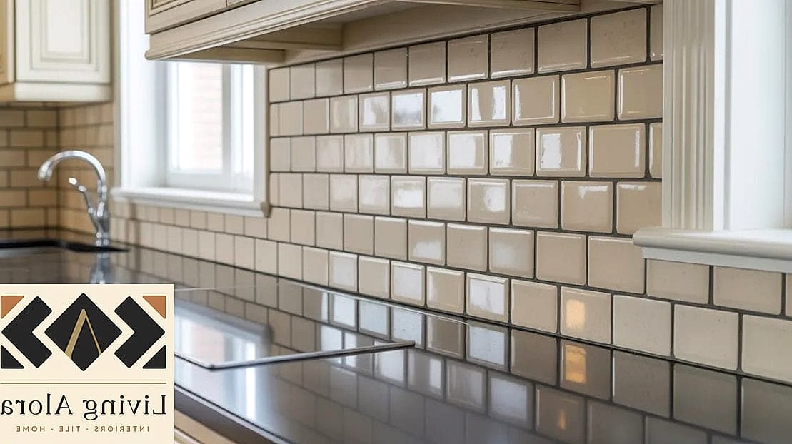
Beige and sand-toned grout have quietly become popular again, especially as warm, earthy color palettes replace the all-white kitchens of the past decade. Paired with white or cream subway tile, it creates a soft, sunbaked look that feels more organic than stark white grout.
This is a lovely option for kitchens with wood accents, butcher block counters, or terracotta-inspired decor, since it ties the whole palette together instead of competing with it. It also works really well behind a stove where grease splatter is a near-daily reality.
Sand-toned grout is naturally more forgiving than pure white when it comes to hiding oil stains and light discoloration, so it’s a practical pick for anyone who cooks often. Just keep in mind that under certain lighting, beige grout can read slightly yellow, so it’s worth viewing a sample in your actual kitchen lighting first.
Black Grout for Maximum Contrast

If charcoal feels like it’s playing it a little safe, black grout is the full commitment version. Set against white or cream subway tile, it creates serious visual punch and gives even a basic tile layout a custom, high-end feel.
This look is especially popular in herringbone or vertical stacked installations, where the strong grout lines emphasize the pattern rather than blend into it. It’s a favorite in moody, modern kitchens and bathrooms that lean into black fixtures, black window frames, or dark cabinetry.
On the practical side, black grout is genuinely one of the lowest-maintenance choices here since it barely shows dirt or staining. The tradeoff is that it can look a bit stark in smaller or naturally dark rooms, so it tends to shine brightest in spaces with good natural light or layered lighting.
Greige Grout for a Blended Look
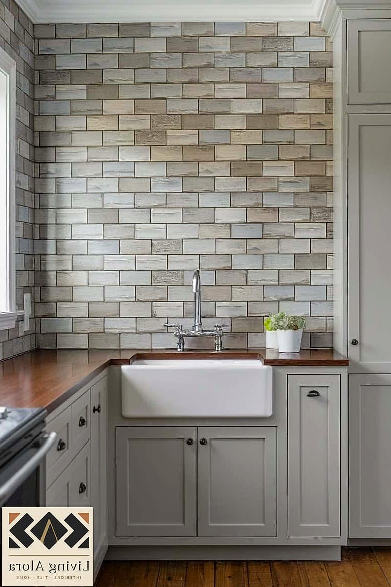
Greige — that gray-beige hybrid everyone loves for paint colors — works just as well in grout form. It’s a subtle, sophisticated option that reads as neutral without falling into stark white or heavy gray territory.
This shade is a great match for transitional kitchens and bathrooms that mix warm and cool tones, like matte black fixtures next to warm wood open shelving. It doesn’t fight with other finishes, which makes it a safe long-term choice if you tend to update decor often.
Greige grout also does a nice job masking everyday wear, splitting the difference between the high-maintenance nature of white and the boldness of charcoal. It’s a smart pick if you want something that feels current without committing to a strong design statement.
Navy or Deep Blue Grout

Colored grout is having a moment, and navy is leading the charge for good reason. Paired with white subway tile, it adds a jewel-toned richness that feels unexpected in the best way, especially in a powder room or laundry room where you can afford to take a few more risks.
Navy grout works particularly well in coastal or classic Americana-style spaces, and it pairs beautifully with brass or gold fixtures for a bit of glam. It’s also a great way to add personality to a small bathroom without committing to colored tile itself.
Because it’s a saturated color rather than a neutral, deep blue grout hides daily grime reasonably well, similar to charcoal or black. The main thing to consider is longevity of style — colored grout is bolder and more memorable, so it’s worth thinking about whether you’ll want that look in five or ten years.
Terracotta or Rust Grout
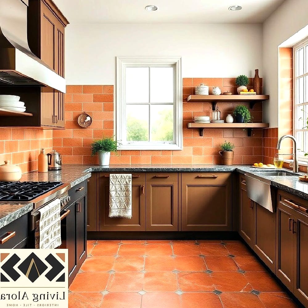
For anyone drawn to warm, earthy design trends, terracotta grout is a fun way to bring in color without painting a single wall. Against white subway tile, it creates a warm, sunlit look that feels grounded and a little bit Mediterranean.
This pairing shines in kitchens with warm wood tones, natural stone counters, or greenery, and it’s a particularly good match for herringbone-patterned backsplashes where the grout lines get extra visual real estate. It’s not a color you see everywhere yet, which makes it feel fresh.
Practically speaking, terracotta grout does a nice job camouflaging cooking splatter and general kitchen grime, similar to other warm, mid-tone shades. Just be mindful that strong colored grout is harder to change your mind about later than a neutral, so it’s a bigger commitment than white or gray.
Matching Grout for a Seamless Monochrome Look
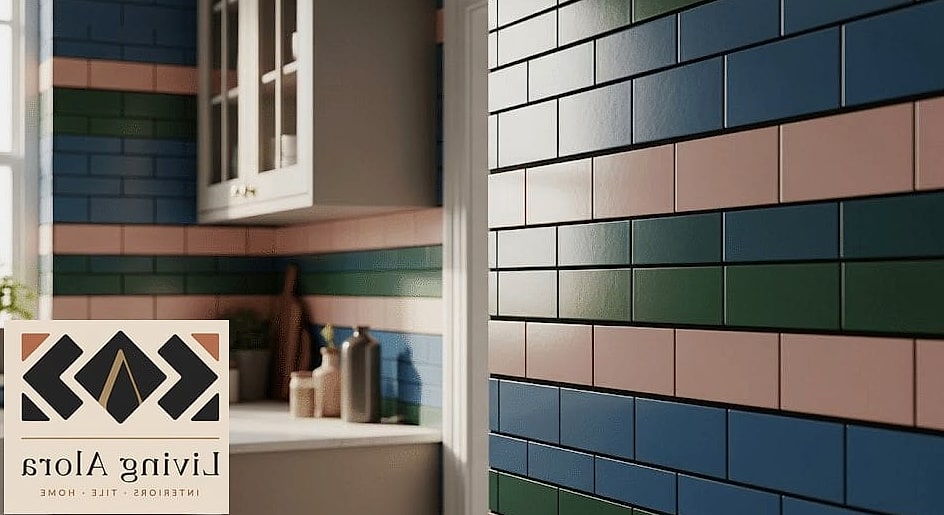
Sometimes the best grout color is the one that disappears entirely. Choosing a grout shade that closely matches your subway tile — whether that’s white-on-white, gray-on-gray, or even a colored tile with matching grout — creates a smooth, monolithic look with almost no visible grid pattern.
This approach works beautifully in modern and minimalist bathrooms, especially with larger format subway tile or a vertical installation where you want the wall to read as one continuous surface. It’s also a popular choice for walk-in showers where a busy grout pattern can feel visually overwhelming in a small space.
Matching grout tends to be more forgiving than stark white on darker or colored tile, since it blends rather than highlights any buildup. The main consideration is that this look relies heavily on quality installation, since uneven grout lines are much more noticeable when there’s no contrast to distract from small imperfections.
Final Thoughts

At the end of the day, there’s no single right answer among these nine grout colors for subway tile ideas — it really comes down to how much contrast you want and how much maintenance you’re willing to take on. Lighter grout tends to need more upkeep but keeps things feeling open and classic, while darker and colored options trade a bit of boldness for lower daily maintenance.
If you’re not sure where to start, grab a few sample boards or tile squares and test different grout colors in your actual space under your actual lighting. What looks great in a showroom can read completely differently once it’s on your wall, and this is one home upgrade where a little test run really does save you from a costly do-over.