15 Neutral Backsplash Ideas We Can’t Stop Pinning
- Classic White Subway Tile with Warm Grout
- Soft Beige Zellige Tile
- Large-Format Marble-Look Porcelain
- Herringbone Pattern in Cream Tones
- Vertical Stack Subway Tile
- Textured Matte Ceramic in Warm White
- Natural Stone Mosaic in Taupe and Cream
- Slab Backsplash in Quartz
- Bone-Colored Handmade Tile
- Basketweave Pattern in Soft Gray
- Extended Backsplash to the Ceiling
- Warm Gray Fishscale Tile
- Limewash-Effect Tile
- Mixed Neutral Mosaic with Metallic Flecks
- Simple Painted Faux-Tile Backsplash
15 Neutral Backsplash Ideas We Can’t Stop Pinning
If you’ve spent any time scrolling design inspo lately, you’ve probably noticed neutral backsplashes are having a real moment. And honestly? It makes sense. Neutral doesn’t mean boring anymore — it means versatile, calming, and easy to live with for the next decade instead of the next two years.
I’ve pulled together fifteen neutral backsplash ideas that keep showing up in my saved folders, and each one brings something a little different to the table. Some are budget-friendly weekend projects, others are splurge-worthy statement moments. Let’s get into it.
Classic White Subway Tile with Warm Grout
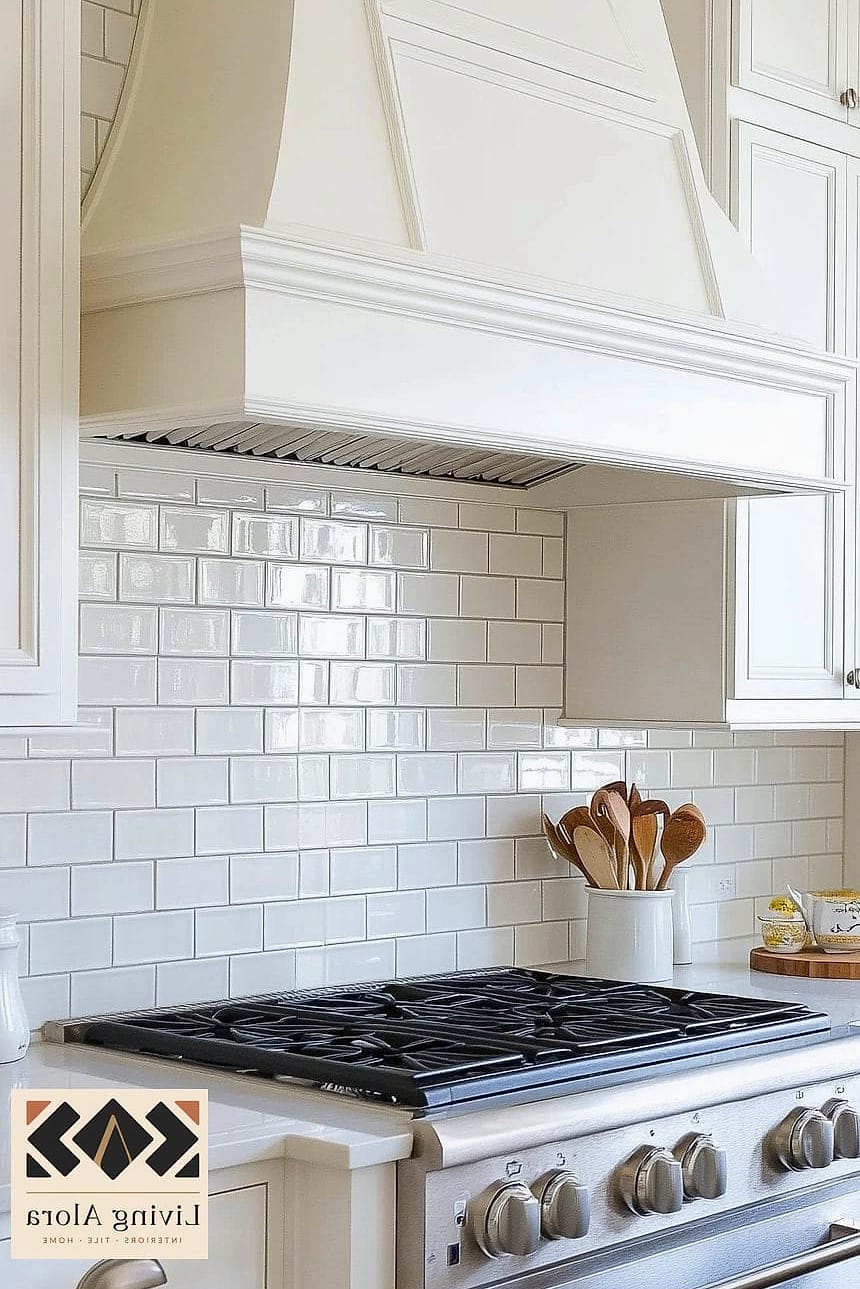
There’s a reason this one never goes away. White subway tile is the little black dress of kitchen design — it works with literally everything, from farmhouse to modern to transitional spaces.
Swapping the usual bright white grout for a warm greige or taupe tone softens the whole look and hides daily grime better. It’s an easy DIY for anyone comfortable with a tile spacer and a notched trowel, and it’s one of the more affordable options on this list, especially with ceramic tile instead of porcelain.
Soft Beige Zellige Tile
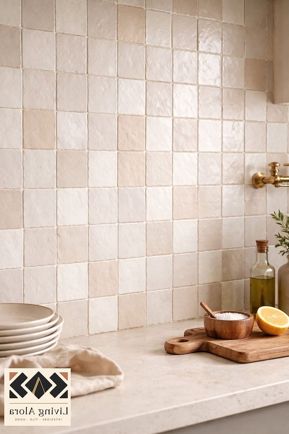
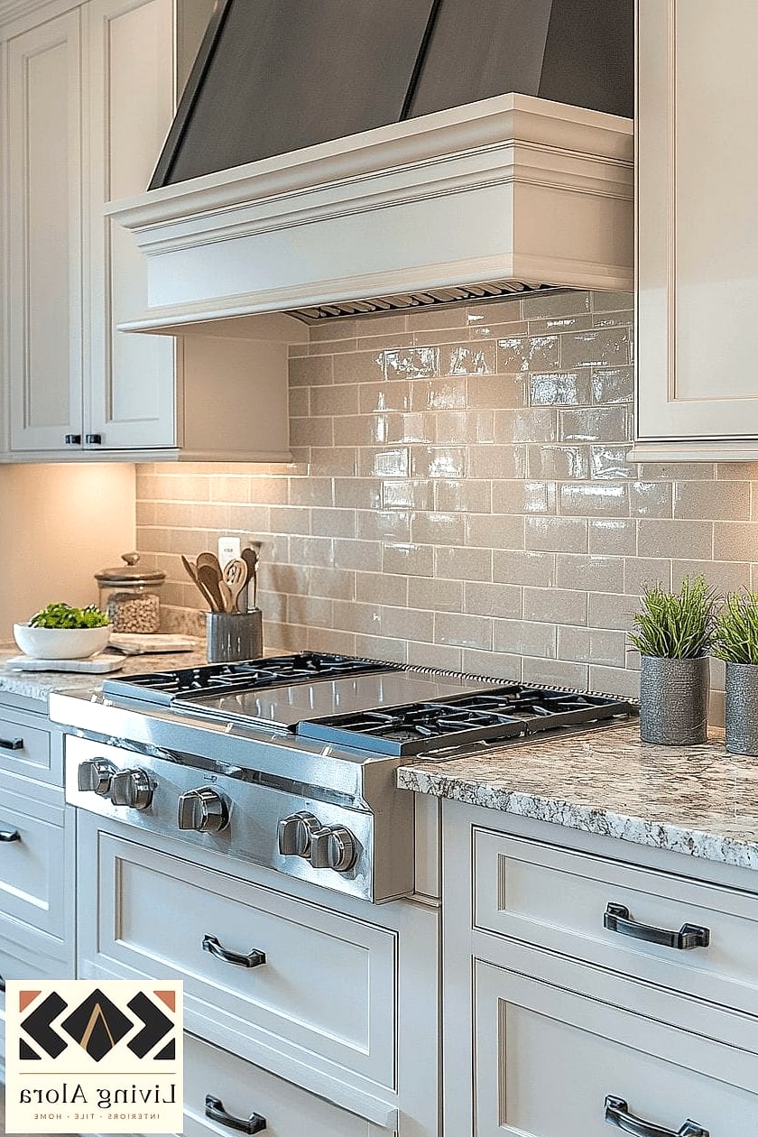
Zellige tile brings texture without adding a ton of color, which is exactly why designers keep reaching for it in neutral kitchens. Each handmade tile has slight variations in tone and surface, so the wall catches light differently throughout the day.
It pairs beautifully with brushed brass hardware and warm wood cabinetry. It’s pricier than standard ceramic and takes a bit more skill to install evenly, so this might be one to hire out unless you’re an experienced DIYer.
Large-Format Marble-Look Porcelain
Marble is gorgeous, but real marble in a kitchen means babying it forever. Porcelain tile that mimics marble veining gives you that same luxe look with way less maintenance and a much friendlier price tag.
Going large-format also means fewer grout lines, which translates to less scrubbing later. This is a solid pick for anyone who wants a high-end feel without committing to natural stone upkeep.
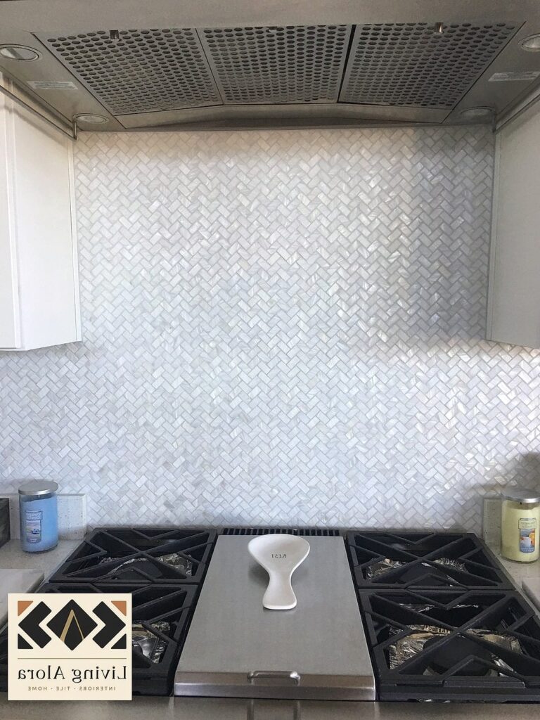
Herringbone Pattern in Cream Tones
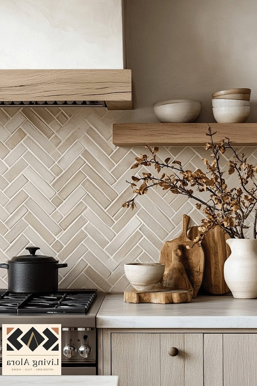
Layout can do just as much work as color. A herringbone pattern in a soft cream tile adds movement and visual interest to an otherwise quiet palette.
This works especially well behind a stove as a focal point, even if the rest of your backsplash is a simpler layout. It does require more precise cutting, so budget extra time or extra tile if you’re tackling it yourself.
Vertical Stack Subway Tile
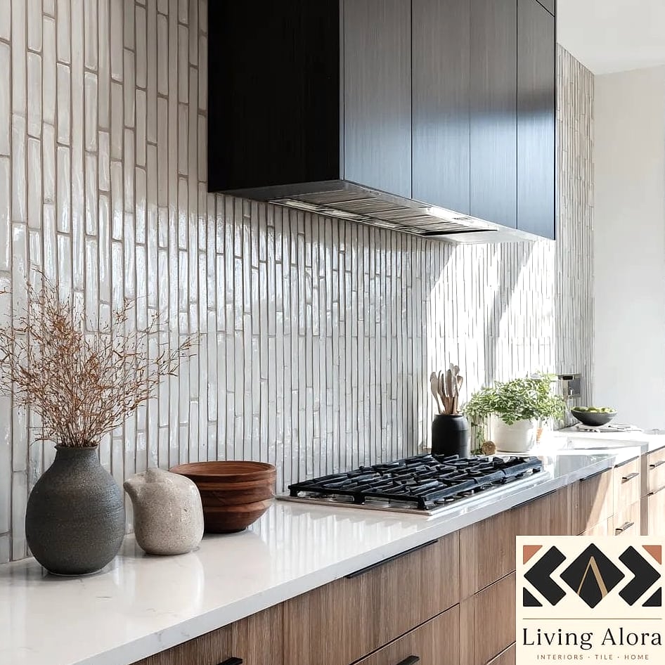
Turning traditional subway tile on its side changes the whole personality of a kitchen. A vertical stack draws the eye upward, which is a nice trick in kitchens with lower ceilings.
Stick with a neutral tone like oyster white or soft greige, and let the unusual layout be the star. It’s a small tweak that makes a big difference in how custom the space feels.
Textured Matte Ceramic in Warm White
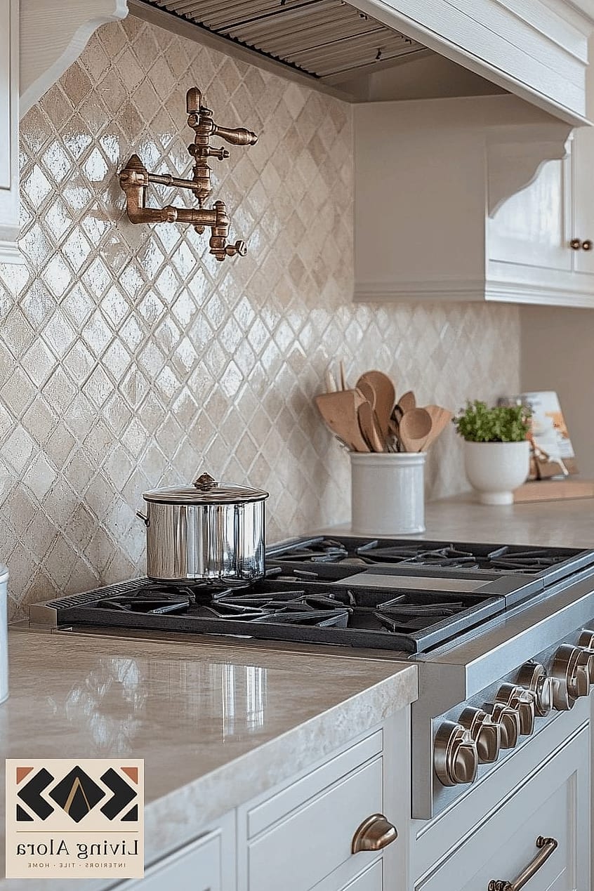
Glossy tile has its place, but matte finishes are quietly taking over neutral kitchens right now. A warm white ceramic with a slightly textured surface adds depth without introducing any extra color.
Matte tile also tends to show water spots and fingerprints less than glossy options, which is a nice bonus if you’ve got kids or a busy household. It’s easy to wipe down with just soap and water.
Natural Stone Mosaic in Taupe and Cream
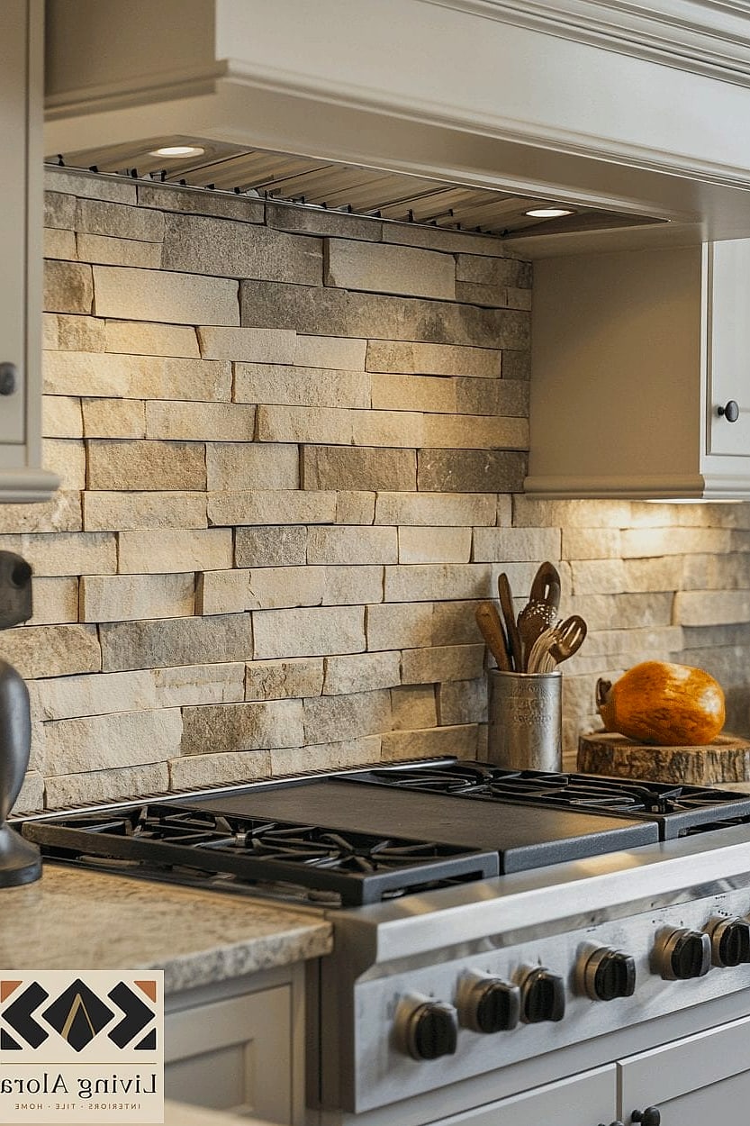
Mosaic tile made from natural stone gives you built-in variation — think soft taupes, creams, and warm grays all mixed together on one sheet. It reads as neutral from across the room but has real depth up close.
This is a great option if you want something more textured than subway tile but aren’t ready to commit to a bold pattern. Just know that natural stone typically needs periodic sealing to stay stain-resistant.
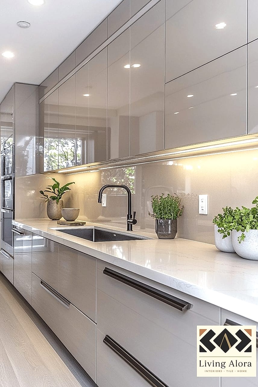
Slab Backsplash in Quartz
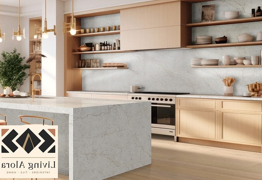
Skipping tile altogether and running a quartz slab up the wall is one of the sleekest neutral options out there. No grout lines means virtually no scrubbing, which is a huge win if cleaning isn’t your favorite weekend activity.
Matching the slab to your quartz countertops creates a seamless, almost monolithic look. It’s an investment upfront, but the low-maintenance payoff is real.
Bone-Colored Handmade Tile
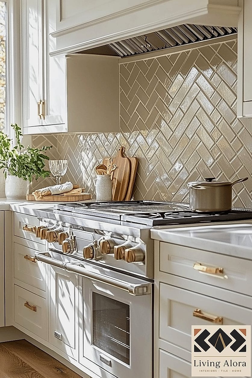
Handmade tile in a warm bone or ivory shade brings character without leaning into any trendy color that might feel dated in a few years. The slight imperfections in handmade tile give it a lived-in, collected feel.
It plays especially well in kitchens with open shelving and warm wood accents, since the tones tend to complement natural materials rather than compete with them.
Basketweave Pattern in Soft Gray
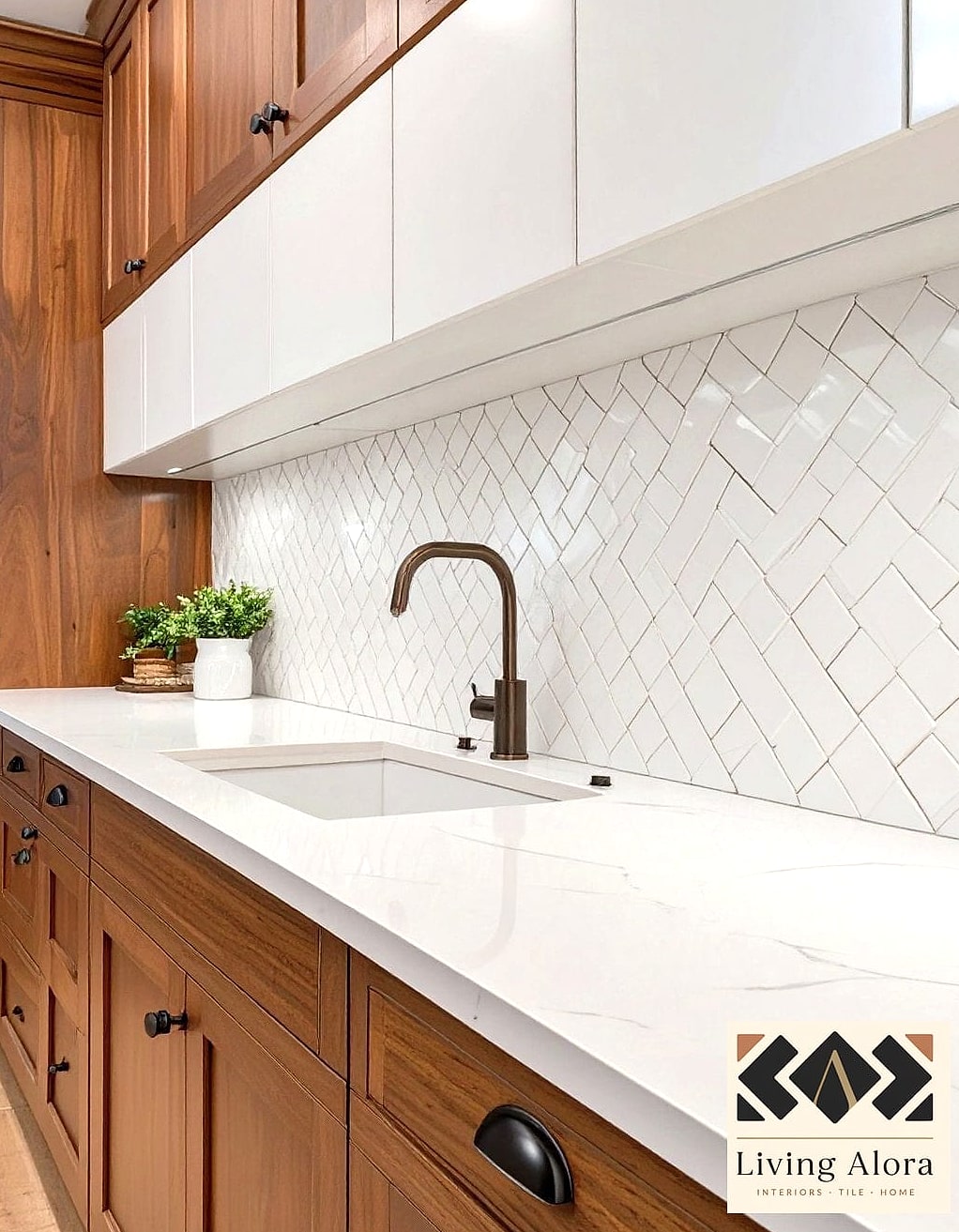
Basketweave is a layout that’s been around forever for a reason — it adds pattern and texture while staying firmly in neutral territory when done in soft gray or greige tones. It reads more traditional than herringbone but still feels fresh.
This pattern works nicely in smaller kitchens where you want visual interest without overwhelming the space. Peel-and-stick basketweave options exist too, if you’re renting or just want a lower-commitment trial run.
Extended Backsplash to the Ceiling
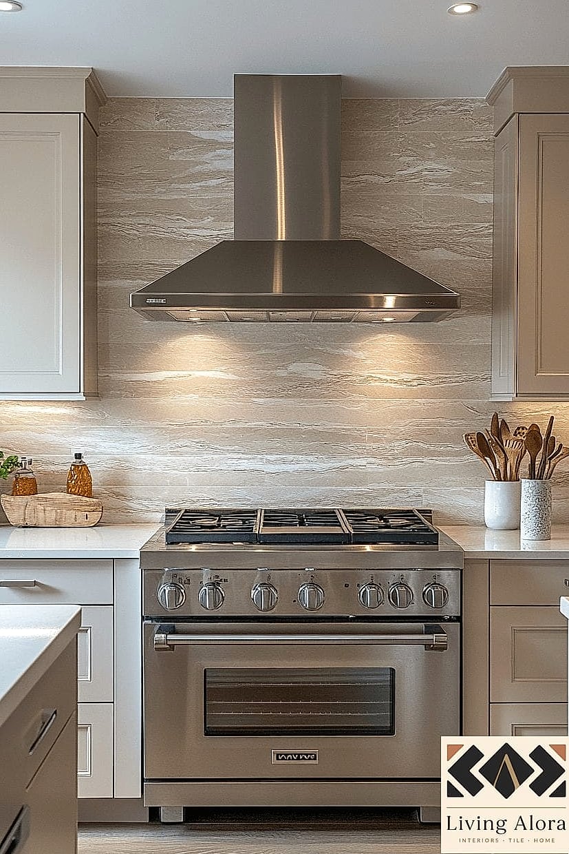
Sometimes the idea isn’t about the tile itself but how far you take it. Running a neutral tile all the way up to the ceiling, rather than stopping at the standard 18 inches, makes a kitchen feel taller and more intentional.
This works particularly well with a simple subway or plain ceramic tile since the height already does the visual heavy lifting. It’s a bigger project and pricier since you’re covering more square footage, but the payoff in perceived ceiling height is worth it in smaller kitchens.
Warm Gray Fishscale Tile
Fishscale tile has a playful, slightly retro feel, but keeping the color palette in warm grays and creams pulls it back into neutral, timeless territory. The scalloped shape adds softness to a kitchen full of hard angles and straight lines.
It’s a fun accent option behind a range or as a small feature wall rather than covering an entire kitchen, since a little bit goes a long way visually.
Limewash-Effect Tile
Limewash finishes have moved from walls to tile, and the effect is stunning in a neutral kitchen. You get that cloudy, hand-painted texture in soft off-white or warm gray tones, which adds a lot of character for a material that’s technically still “neutral.”
This is a newer trend, so it might be harder to find at big box stores — specialty tile shops or online retailers are your best bet.
Mixed Neutral Mosaic with Metallic Flecks
For anyone who wants a little sparkle without going full glam, a neutral mosaic tile with subtle metallic flecks scattered through warm whites and taupes offers just enough shimmer under kitchen lighting. It photographs beautifully but doesn’t overwhelm in person.
This pairs nicely with brushed brass or matte black fixtures, depending on which direction you want to lean.
Simple Painted Faux-Tile Backsplash
Not every neutral backsplash idea requires actual tile. For renters or anyone on a tight budget, a faux-tile painted finish using stencils and a neutral palette of creams and soft grays can mimic the look of subway or geometric tile for a fraction of the cost.
It’s fully renter-friendly, reversible with a coat of primer, and a genuinely fun weekend DIY project if you enjoy painting more than grouting.
Final Thoughts
What I love most about neutral backsplashes is that they let other design choices shine — your cabinet color, your hardware, your countertops — without competing for attention. And as this list hopefully shows, “neutral” doesn’t have to mean plain. Between pattern, texture, and finish, there’s a lot of room to make a quiet color palette feel completely your own.
If you’re planning a backsplash project soon, start by pulling a few tile samples and living with them in your kitchen lighting for a few days before committing. What looks perfect on a screen can read totally different once it’s on your wall.